Project overview
Because is a subscription ecommerce site for incontinence products and other health supplements for seniors. They have their own in-house CRO program but were looking for fresh eyes on their funnel and onboarding experience. After looking under the hood I was able to come up with a variety of CRO tests, supported by high-res designs, that ultimately led to a complete overhaul of their acquisition funnel and conversion strategy.
Business objectives
- Improve conversion rates while being mindful of downstream user retention
- Raise awareness around subscription
- Decrease cancellation rate
- Improve overall brand equity and trust
Funnel analysis
Drop-off rates
| Funnel Step | Unique Visits | Step CVR | Drop-off |
|---|---|---|---|
| Quiz | 34,294 | 50.6% | |
| PDP | 16,939 | 49.4% | 45.9% |
| Product Confirmation | 9,158 | 54.1% | 44.3% |
| Address | 5,103 | 55.7% | 53.4% |
| Payment | 2,377 | 46.6% | 61.7% |
| Thank You | 901 | 38.3% |
Data insights
Sure it looks like a normal funnel — the numbers decrease — but there is a story here.
- Extraneous step?
We lose 44.3% of customers on the product confirmation page, and that is a step I don't usually see in funnels. My thinking is that maybe I can simplify the flow. If we look at the PDP + Product Confirmation as a combined step, we actually lose 80% of all users. If you look at from PDP -> Checkout as one step, this is by far the largest friction point.
- Quiz engagement?
The initial quiz yields a 50.6% drop-off. So we lose half of our audience on the initial engagment. Not terrible, but if we can improve this we can get more users into the funnel.
- Payment hesitancy
There is a 61.7% drop-off on payment. I'm used to seeing the highest drop-off here. However, if we can reduce this rate we can move the needle significantly.
Qualitative research
Data shows that the weakest funnel step is Payment, but friction on Payment could mean that there is confusion elsehwere in the funnel. So I conducted additional qualitative research which really helped to connect the dots found in the data. This involved reviewing chat logs, offboarding feedback, and running on-site feedback polls. Three main themes emerged which supported my design decisions.
- Confusion over subscription
By far one of the biggest hestitations I uncovered was confusion that users are signing up for a subscription rather than buying a la carte. - Free trial hesitation
Users who understand the free trial -> subscription nature of the product were hesitant to commit. Users were confused about how the free trial works. - Overall UX/UI issues
A heuristic walkthrough of the full funnel shows a lot of issues with the UX/UI in general, especially for a senior audience.
Hypotheses
Based on the funnel data and qualitative research, I was able to formulate several hypotheses.
- Faster Checkout TestBy eliminating the Product Confirmation page and working this page into updated designs for adjacent funnel steps, I can reduce confusion and save users time, thus increasing total conversions.
- "My Plan" TestBy emphasizing subscription in several strategic places throughout the onboarding funnel — global progress bar, PDP, and Order Summary — I can better educate users regarding the subscription nature of the product, thus reducing cancellations while preserving conversion rates.
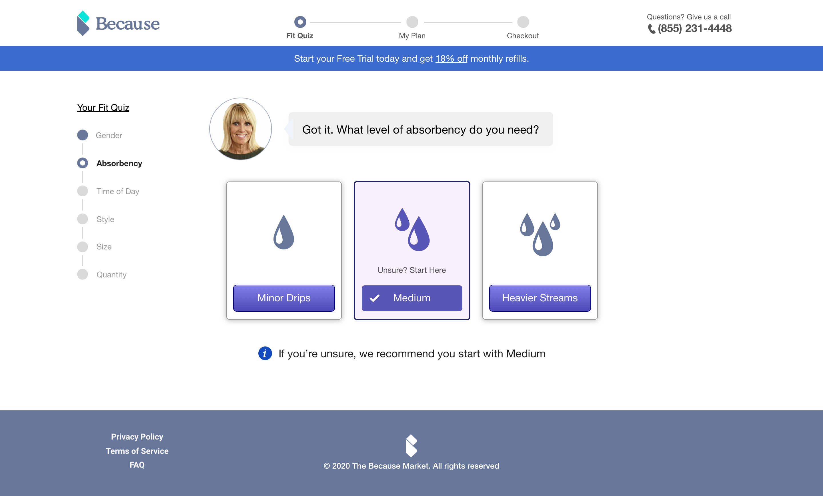
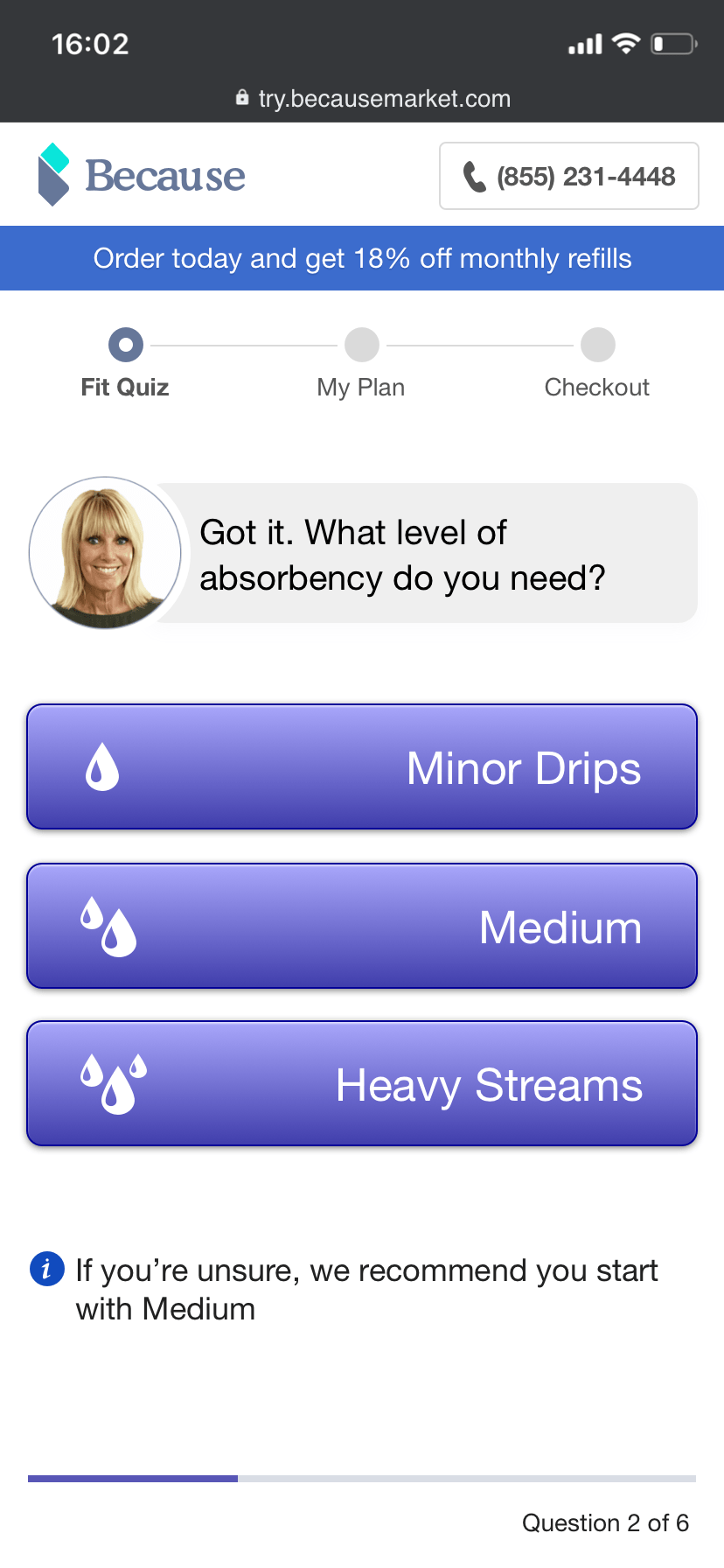
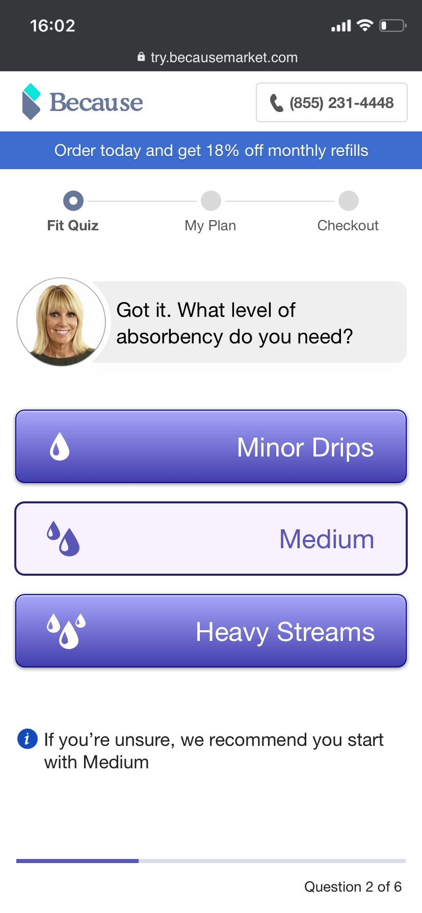
- Quiz Enhancements TestBy updating the look and feel of the quiz I can create a more engaging experience and also increase overall brand equity, thus getting more users to the PDP or "My Plan" page, thus increasing total conversions.
Wireframes
Next I designed new experiences to support my hypotheses, from wireframes to pixel perfect mockups delivered to the client in Zeplin. It's worth noting first, however, that I had come up with an updated flow that shortens the funnel.
Original 6-step flow
Updated 4-step flow
Quiz
Design Notes
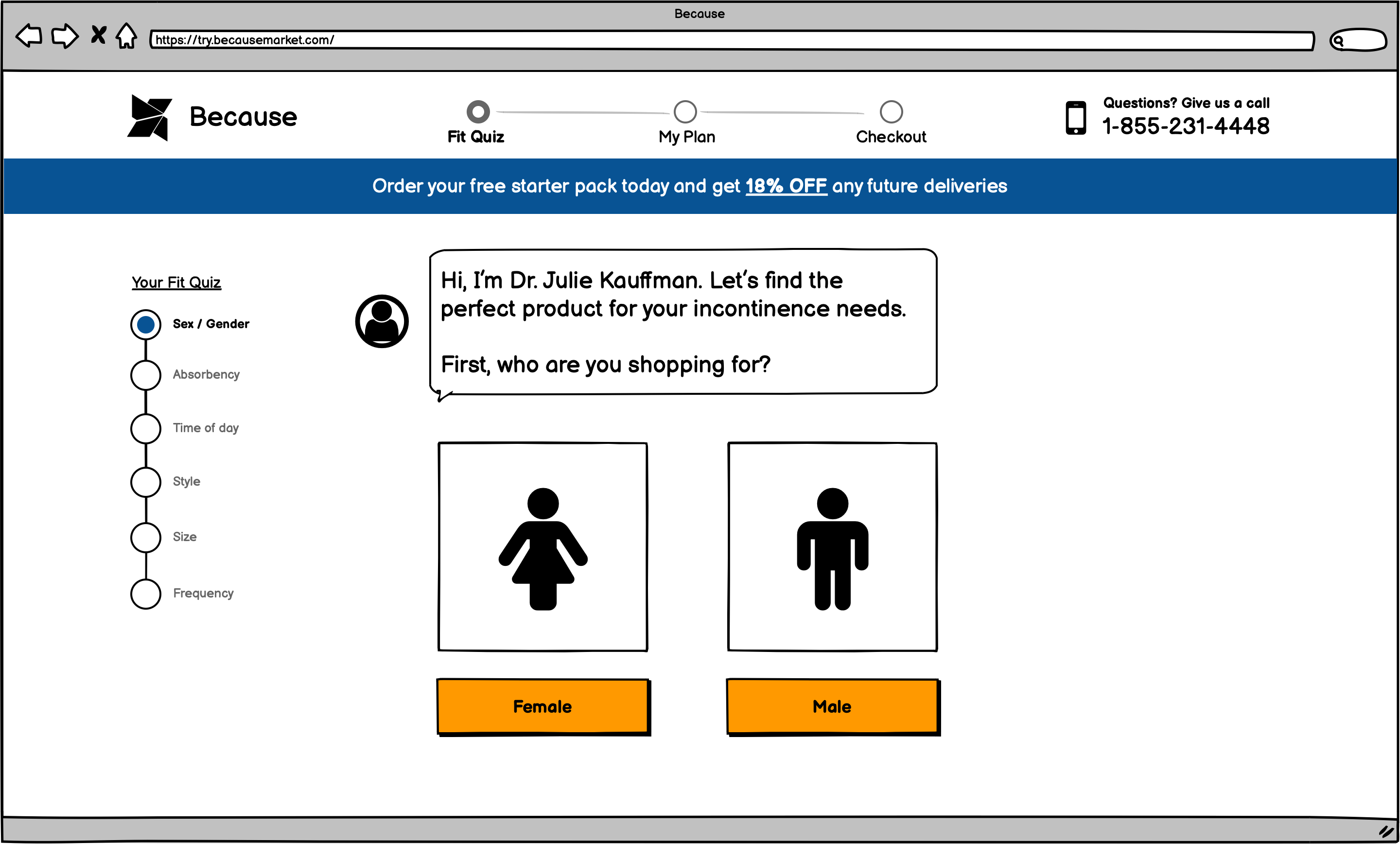
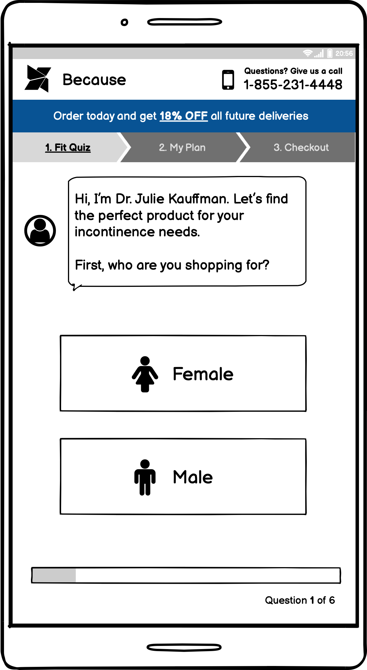
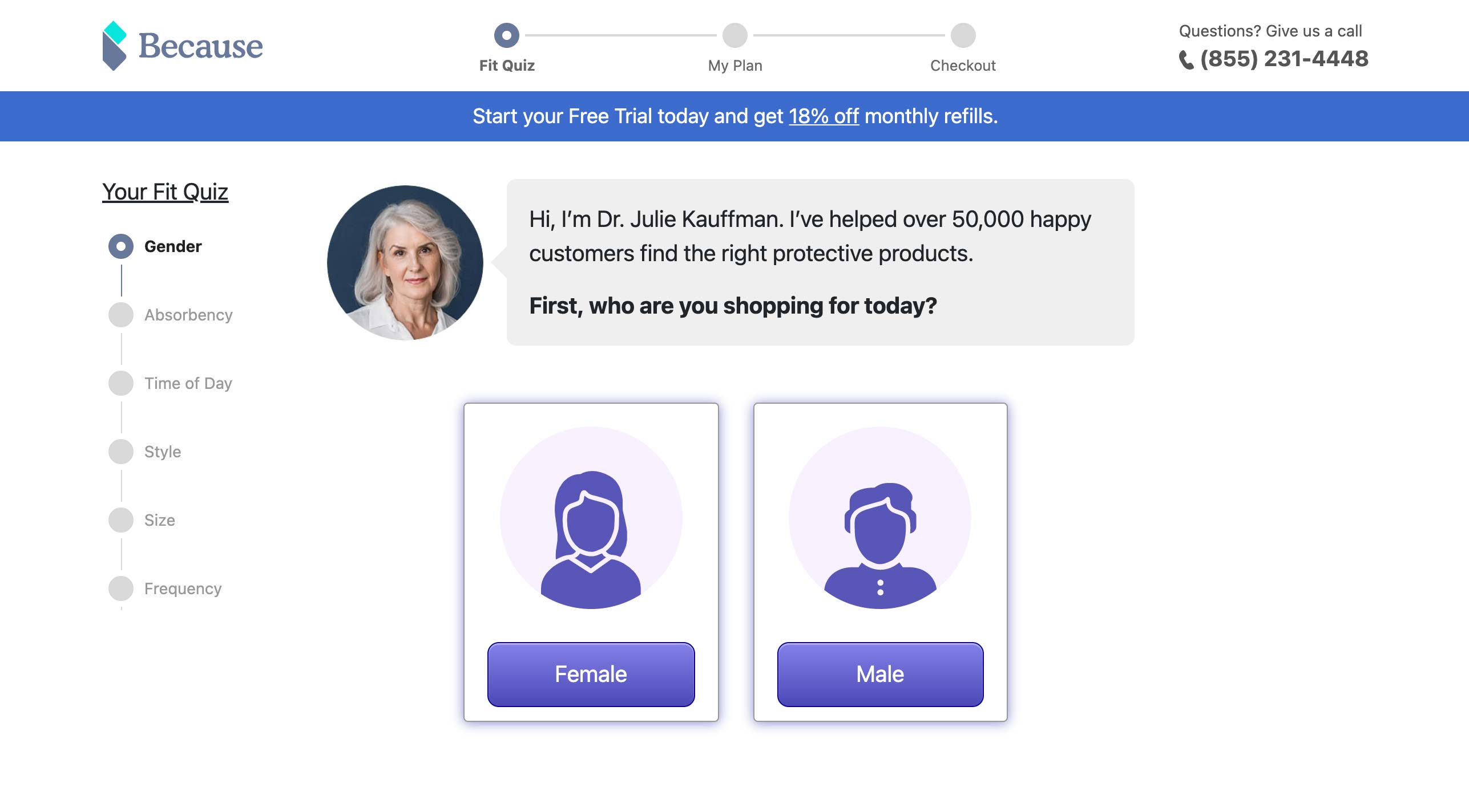
- Added progress bar for all quiz questions to set users' expectations
- Added global progress bar and using language "My Plan" for the Product Detail Page. Users should understand that the PDP is customized based on their quiz answers.
- Included a global "offer bar" with directional language to help push users through the flow. This can change based on query parameters.
- Using lots of white space and larger fonts for breathability and readability
Product Detail Page
Design Notes
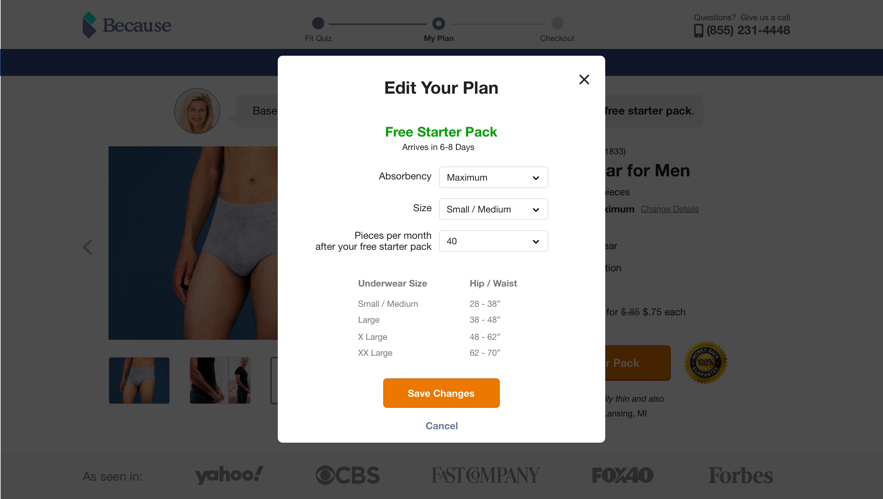
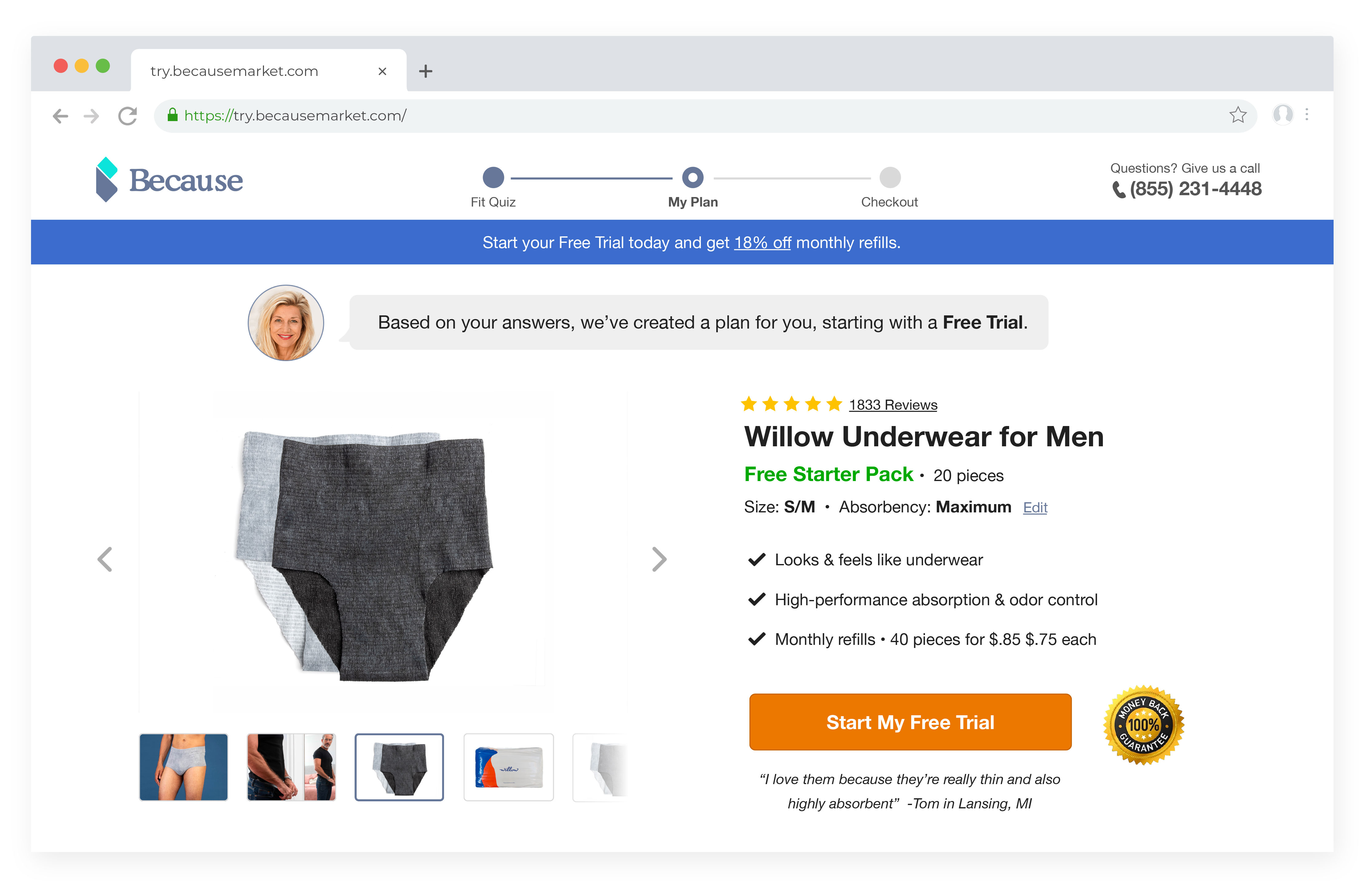
- The primary innovation on the PDP is to improve messaging around subscription and free starter pack. Users should know they will only pay $2.99 today for their starter pack, and they should also be aware of how the subscription — or My Plan — is going to work.
- Ability for users to change the details of their plan exists
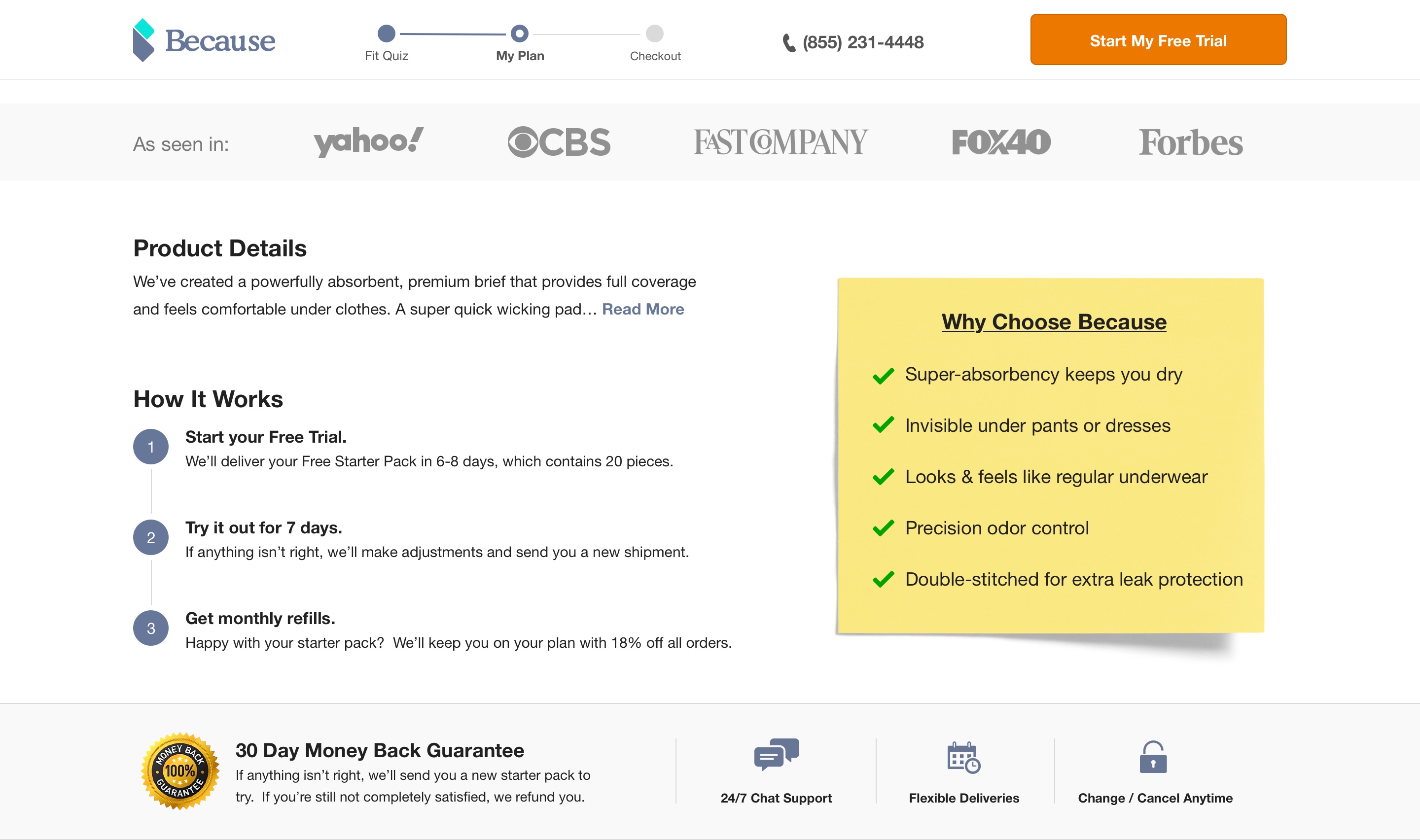
- Above the fold experience includes the value prop in addition to the points above.
- Maintaining the friendly face from the quiz on PDP to connect the experiences better
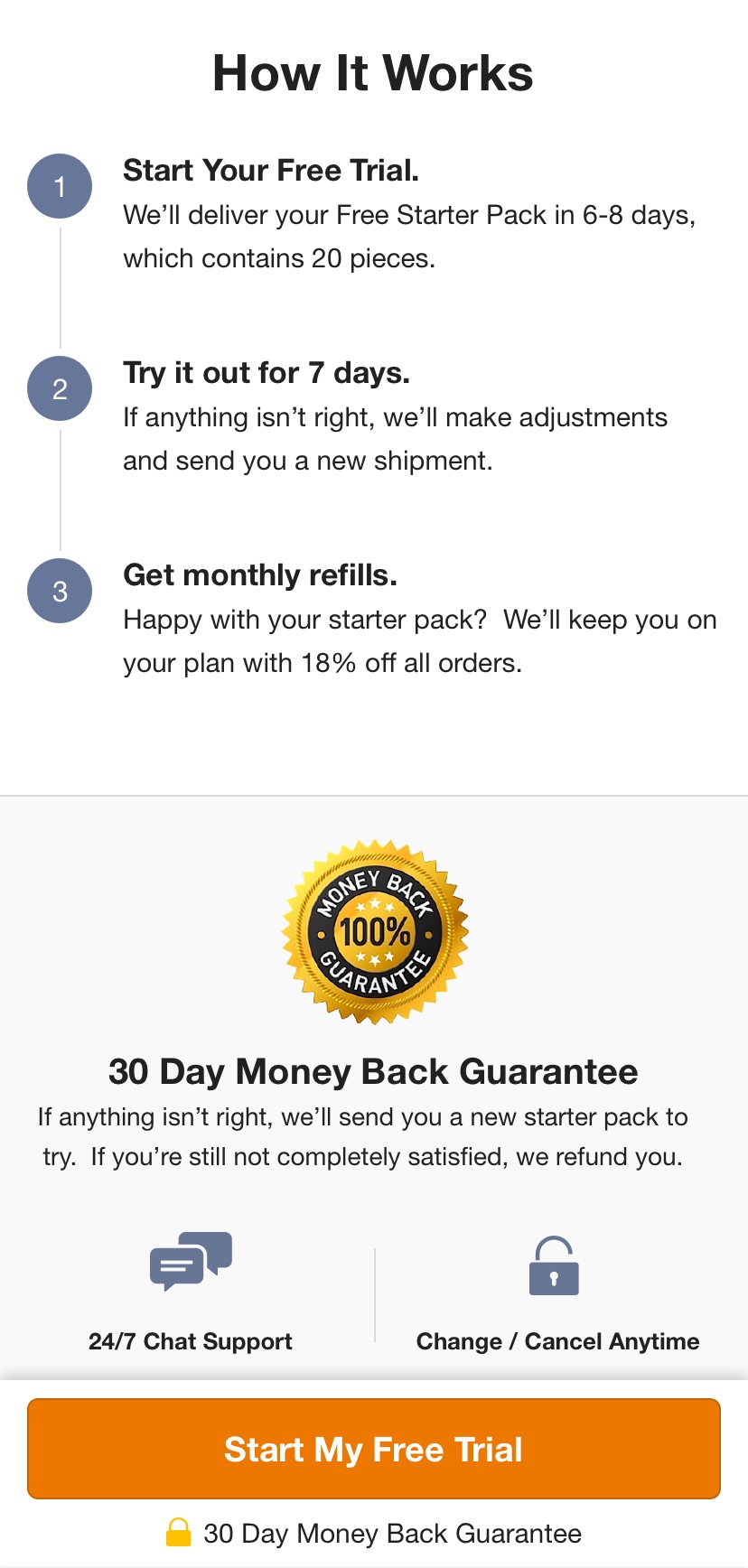
- Added a "How It Works" to the PDP
- Designed an objection management module to help mitigate hesitancy over subscription. Users should know they can cancel at any time and also be aware of the money back guarantee.
- FAQ section exists to help users who are still looking for more information about the products and service.
Checkout
Design Notes
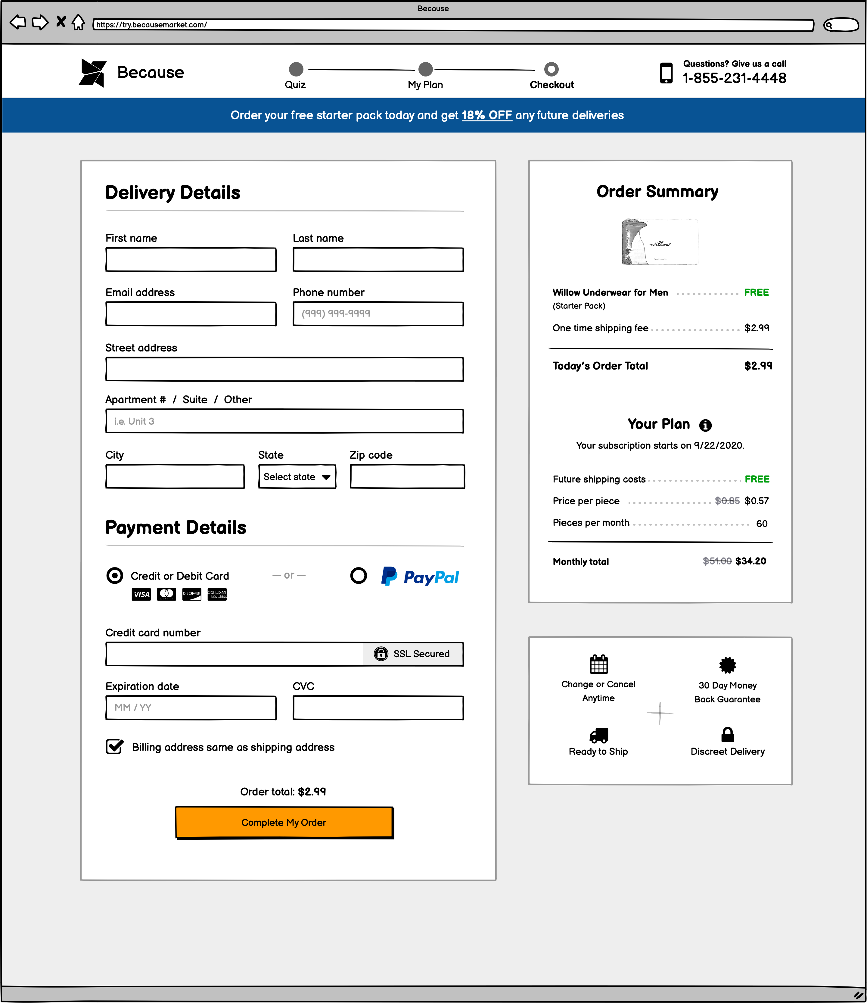
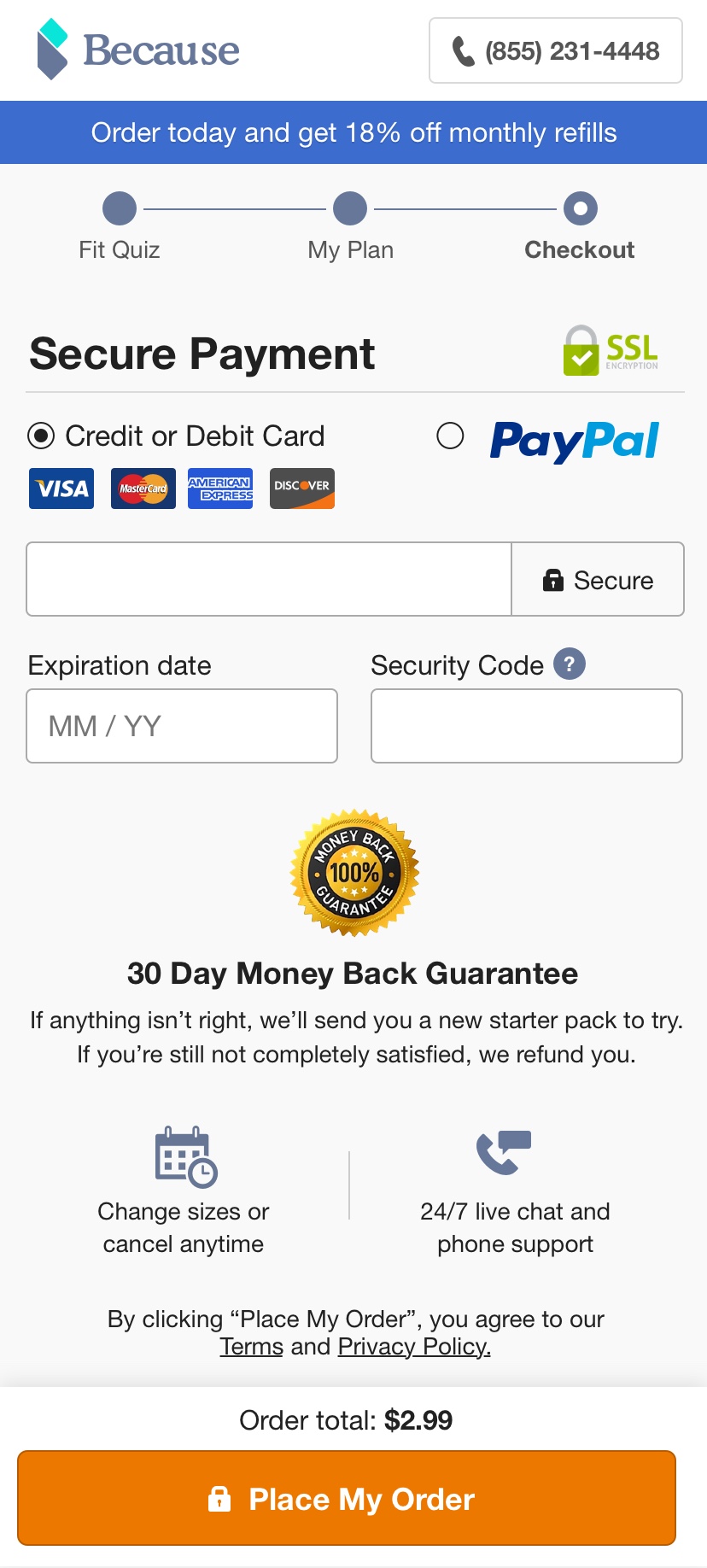
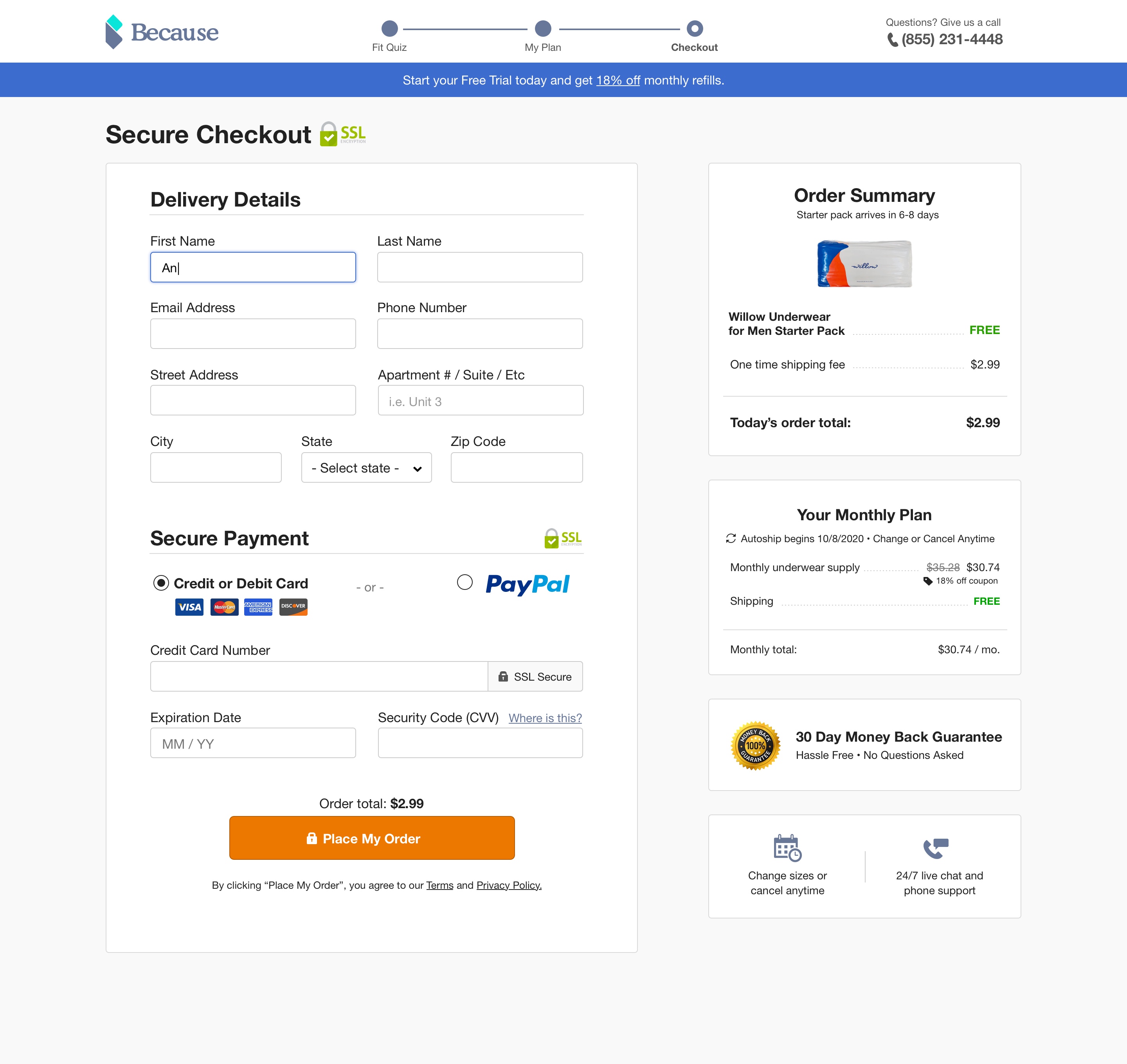
- One Step Checkout
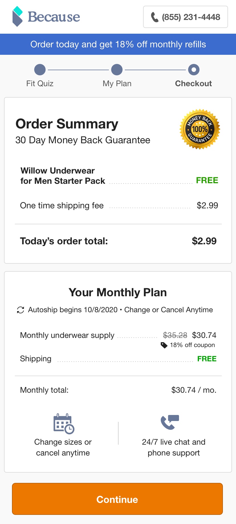
- Added My Plan module underneath order summary
- Included objection management module underneath order summary
- Line items of order summary include the discount from the top offer bar
Visual Design
Lorem ipsum dolor, sit amet consectetur adipisicing elit. Sunt repellendus distinctio, nostrum repudiandae! Totam neque dolor esse ducimus dolore repellat quis, in debitis accusamus voluptates eveniet animi laudantium maxime ea.
Quiz
Product Detail Page
Checkout
Prototyping
When working with clients I often deliver prototypes of my designs using HTML/CSS/JS. That way I can depict interactions, provide code examples for UI elements, and also give stakeholders a way to experience the UI. I also lended a hand in writing the acceptance criteria for tickets in Jira that their dev team would execute. It's important to care about the how, and not just the what. For this reason I like to be involved with the front-end as well.
